


Okay... I Think I Like Liquid Glass
A few reflections on a shiny new direction

Apple’s latest software design has given designers a lot to talk about, and honestly? I like it.
It feels sophisticated and clean. Familiar, but elevated. The approach plays with transparency, lighting, and soft layering in a way that naturally invites designers to try it for themselves. It feels like something Apple was meant to do.
At first, I thought it might just be a trend. A visual moment that would spike in popularity and quietly fade. But after sitting with it a little longer and understanding the deeper connection to Apple’s hardware advances…I’m not so sure anymore.
Apple, as they’ve done many times before, seem to be setting the tone. They have a way of shifting the visual language of software when they really lean in. And this liquid glass aesthetic is stylish and a result of what their technology now makes possible.
It’s also something I’ve experimented with in my own work. That style is fun to create and visually rich. But what I’m still thinking about is this: Will this spark real creative curiosity? Or just more design by momentum?
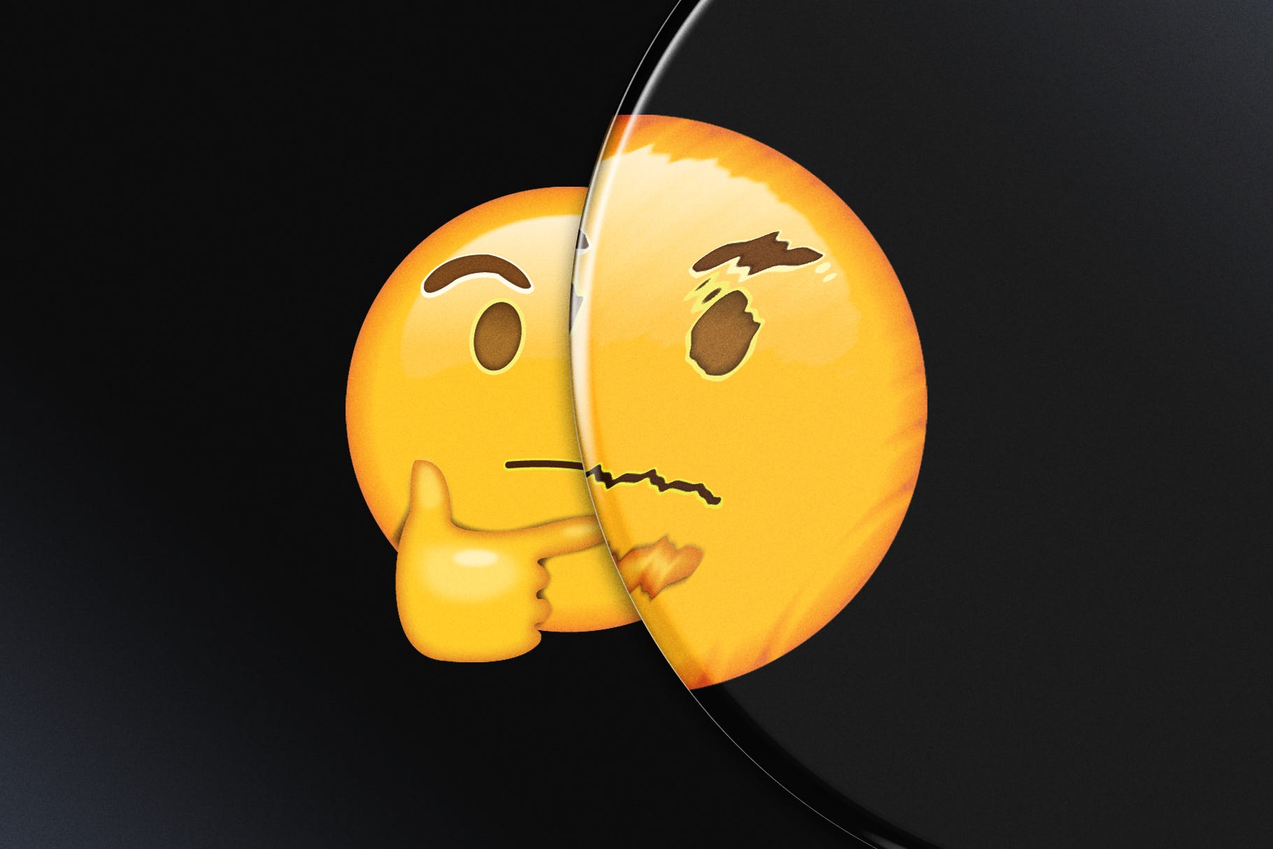
Aesthetics That Invite Touch
What I like the most is how this look makes the digital space feel physical again. Like you could reach through the screen and move things around with your hands. It doesn’t just look great, it’s an invitation to interact.
As a graphic designer, this opens up some really exciting spaces. How can we design with light and depth as part of the experience? How can we move beyond a flat minimalist approach without losing clarity? It’s not about decoration, it’s about presence.
A New Layer of Possibility
Every popular trend runs the risk of being watered down or overused. But that doesn’t mean we should ignore it. I think this is one of those moments where a big design voice creates a visual permission slip for the rest of us to explore, experiment, and reimagine what digital interfaces and design feel like.
Instead of treating this as a passing trend, I’m choosing to see it as a new possibility. A fresh direction that can remind us that even in a digital-first world, design can still feel tangible and layered.
I’m excited to see where this goes and even more excited to keep pushing in my own way.
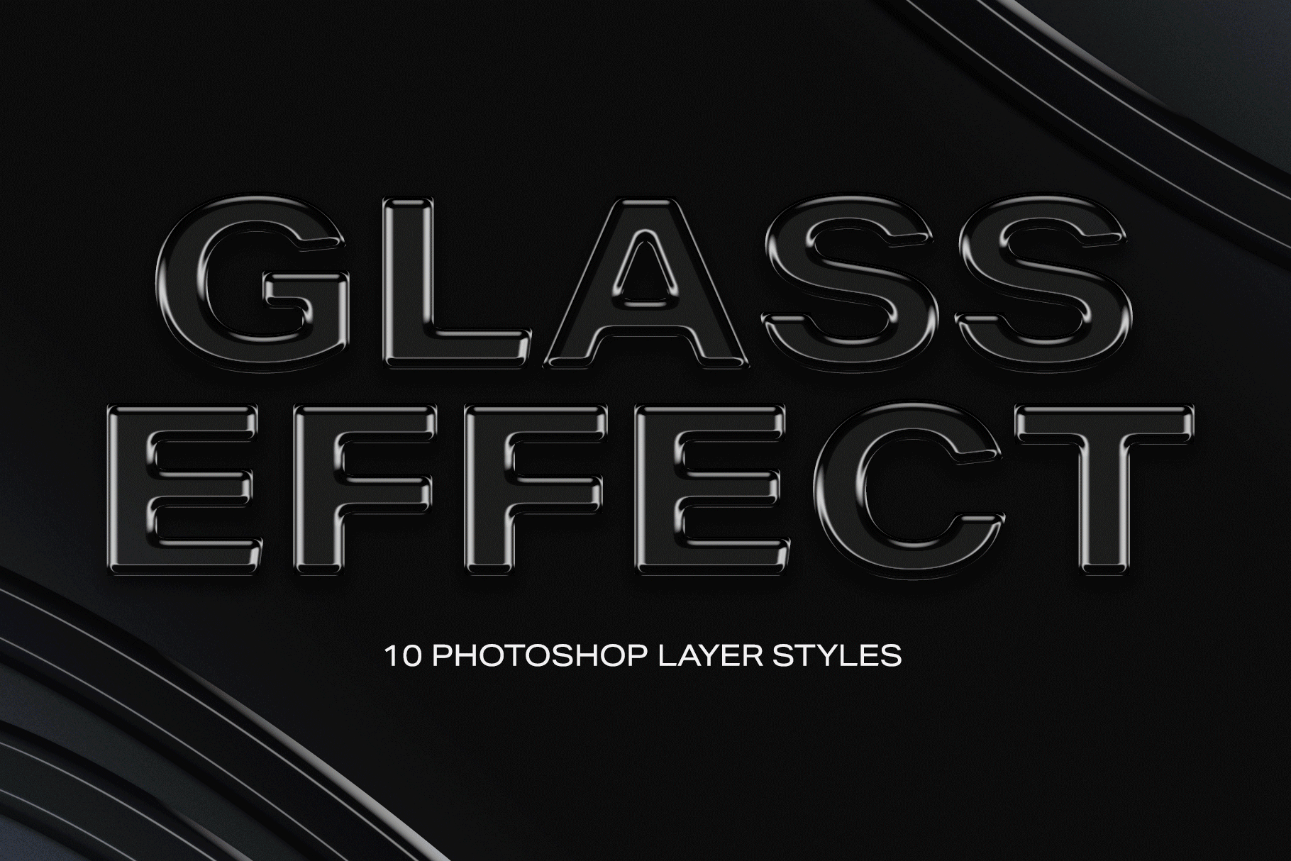
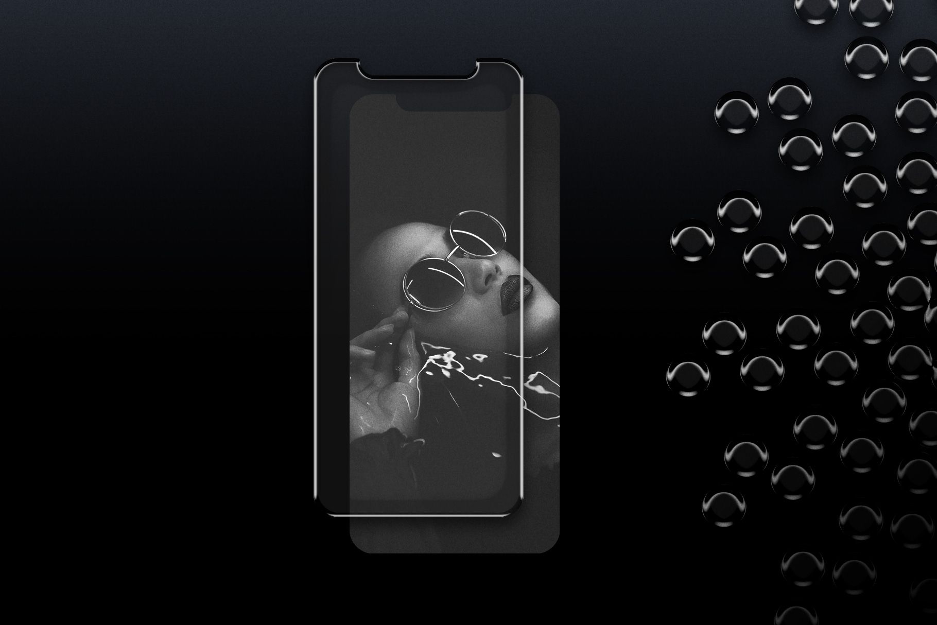
If you’re curious and want to experiment with visuals in the same spirit, I’ve set aside all of my design assets that reflect this style: Acrylic Overlay Objects, Photoshop Glass Effect Styles, and Glass Pattern Effects.
They’re all available in my Gumroad shop, and as a thank-you for reading, you can use the code 5Z3MDVR for 25% off any of them (*Offer valid until Friday, June 27th). Just a little something to spark your own exploration.
As always, thanks for reading. Until next time!
— Jesse
I like it as well, however, the question for me is how the contrast/accessibility will work. I’ve seen photos of the liquid glass notifications on backgrounds that have text on them, and it is, uh, bad lol